The future of mobile app design
The role of mobile app design will only increase in importance as companies compete to win market share worldwide. Here's what we'll likely see reflected.
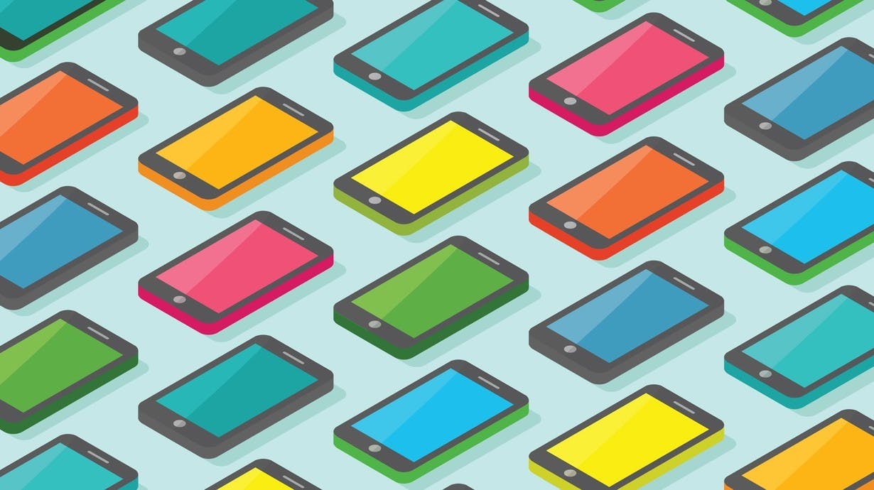
In 2013 we saw a major milestone reached with the first billion smartphones shipped, double the amount from 2 years prior. This trend has continued to grow at a steady rate, with little sign of a slowdown predicted. The 2 billion milestone is likely to be hit at some point in 2016. The role of mobile app UI design will only increase in importance as companies compete to win market share worldwide. With the prospect of reaching so many new users, the competition between consumer product companies will be greater than ever. Ease of use while multitasking will be essential in winning the hearts and minds of customers. To accomplish this we will likely see a surge of design that focuses on intuitive, accessible user interfaces and a consistent experience across all devices.
Changing demographics
According to eMarketer projections the largest growth in smartphone sales through to 2018 will be from the Chinese and Indian markets. India, in particular, is set to eclipse the US market as early as 2016. The US and Western European markets will grow at a much slower rate. In response, the practice of designing only for these customers will likely reduce.
Over the next five years, the focus will instead shift to creating mobile experiences that cater to the rising middle classes of China and India, each containing unique user demographics. Designers and marketers will need to think through language, cultural, and ethnographic particularities to create effective solutions. It will also be important to recognize how specific cultures truly interact with technology. To accomplish this, the solutions must be highly intuitive to give users across all cultures unfettered access to mobile products.
The rise of the phablet
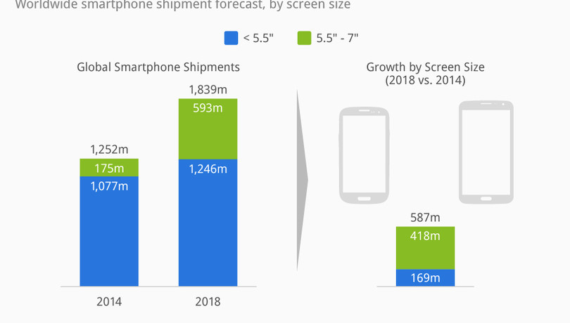
Phablets, which are phones with screens between five and seven inches, have surged in popularity and will soon be the standard. Accenture recently conducted an online survey of 23,000 consumers across 23 countries. About 13,000 (57%) indicated they planned to purchase smartphones this year. Of that 13,000, 48% indicated they will be buying phablets over conventional smartphones. Designers will, therefore, need to transition to designing specifically for these larger displays.
Provided by Statista
The reason for the phablet trend is due to the fact that emerging markets, which are projected to make up most of the smartphone sales in the coming years, prefer phablets. Buyers there are less likely to have the cash for two devices, so they buy the largest smartphones that offer a combination of uses. Consumers in developed countries are less likely to prefer them. In the US and Western Europe, it’s forecasted that phablet purchases will be less than half of that in Asia Pacific markets in 2017.
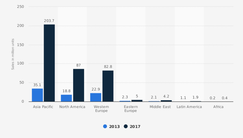
Provided by Statista
Design with multitasking in mind
Multitasking, especially between multiple devices, is now the defacto consumer behavior. User experiences need to prioritize multitasking as a feature. Current data shows that the majority of users (49%) hold their smartphones in just one hand, using their thumb as the main instrument to navigate. One-handed use is highly correlated with performing other tasks such as carrying bags, climbing stairs, opening doors, holding babies, etc. The size of phablets make them difficult to use with one hand. App interface design, therefore, must adapt to consider multitasking and handling such a large device.
Navigation is a great example of a feature that must be re-thought for the phablet audience. What may work on a four-inch screen probably won’t cater well to the user experience on a six-inch device (that is, unless these suddenly become popular). In particular, when primary UI elements live out of reach at the top of the screen, one-handed use can be incredibly difficult and frustrating. If the navigation elements are moved to the bottom of the screen, it’s easier for users to navigate with his/her thumb, without having to engage the other hand. Many designers are already exploring interfaces that elegantly execute this solution. The example below places all the UI elements at the bottom of the screen and employs a hidden navigation, simplifying the UI so the user can focus on the content.
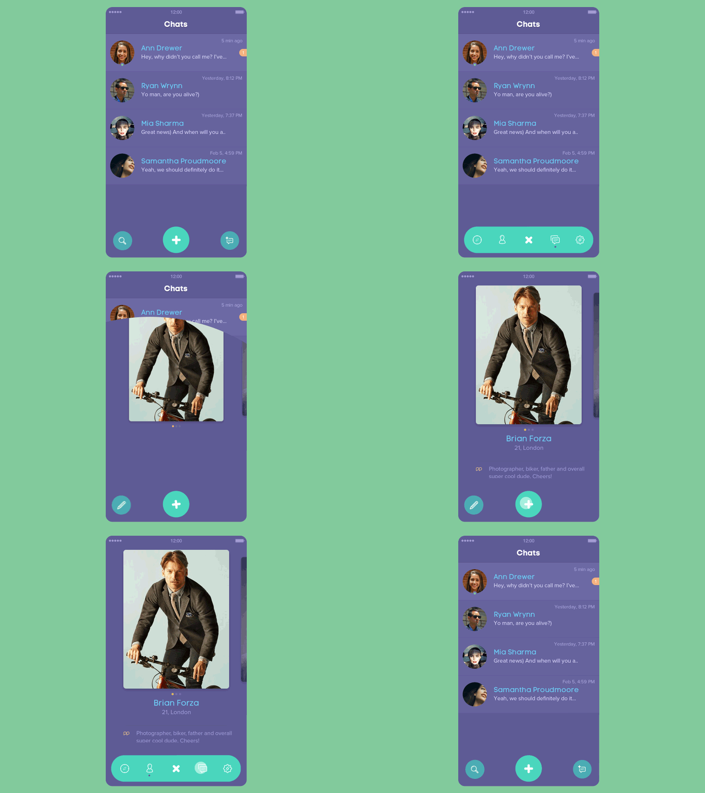
Another projection is that traditional button navigation will be mostly replaced with gesture-based movements. Swiping through card-based layouts like those seen in Tinder and Facebook Paper allow the user to use any portion of the screen to navigate, instead of searching for and locating a small button in a hard to reach location. Tinder’s entire app can be navigated with a single thumb.
Shorter flows
Traditionally, mobile app flows are a series of single screen views. It’s becoming more commonplace to see mobile app content now contained to one screen, similar to how web pages employ a single page design. To make this possible, transitional UI elements are used like expanding/collapsing panels, fold-outs, or other animations to reveal more content. Nesting the content within a single page rather than taking you to a new screen makes it easier for the user to manipulate the information with one hand. The user no longer loses context as they move through an app, and can digest the content more quickly. This is especially important when multitasking as doing two things at once necessitates speed and efficiency.

The future: Convergence
With the ever-growing number of screen sizes it will soon prove impossible to design for every device, therefore mobile app UI is likely to become more universal across tablets and smartphones. Seamless product experiences will be the norm – a user will be able to read an article on their smartphone and then transition to the web without losing their place. Further into the future, we may see a convergence between different platforms, apps, and smartphone manufacturers to provide a universal experience for users – one method of interaction built on shared protocols and standards.
